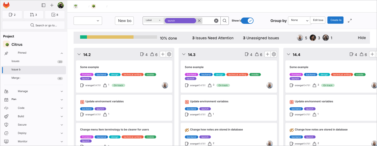
GitLab: Issue Boards
Improving identification time of at-risk issues from up to 45 minutes to a few seconds.
How might we improve the usability of GitLab issue boards for product managers so they can better track progress and understand the status of issues?
My Role
As the project manager, I oversaw project planning and monitoring, managed relationships between the team and our sponsors, established quality checks for designs and deliverables, and was heavily involved in all research and design processes alongside the team (journey mapping, affinity mapping, user interview, high-fidelity prototyping, concept testing, usability testing).
Project Scope
Tufts University Human Factors Engineering Senior Capstone in the Spring 2024 semester.
Proposed by UX department at GitLab (UX Paper Cuts Team - main responsibility is to fix usability issues in GitLab’s product).
Project Outcomes
+ Improved identification time of at-risk issues from up to 45 minutes to a few seconds for product managers.
+ Recieved positive feedback across GitLab’s design leadership.
Background
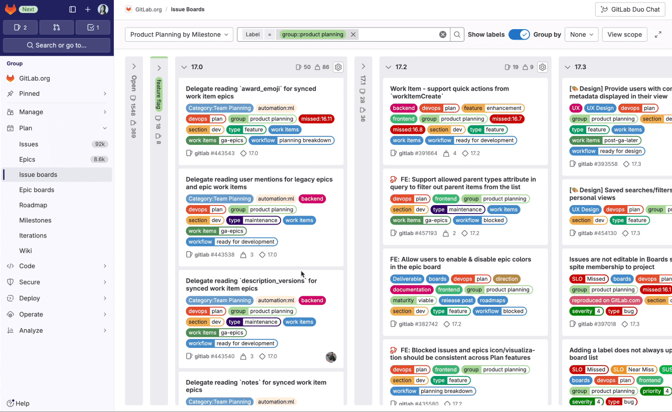
Issue boards is a project management tool used at GitLab to plan, organize, and visualize workflows for feature or product releases.
GitLab is a comprehensive, open-source DevSecOps platform that supports all project tasks. Product managers (PMs) and engineering managers primarily use issue boards to assign tasks, ensure alignment with strategic vision and planning, and assess team capacity, among other responsibilities.
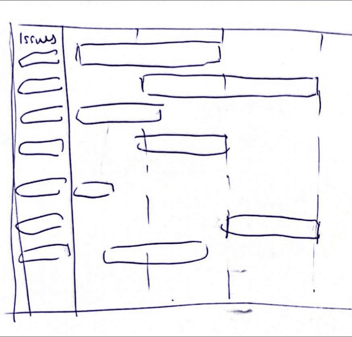
Issue Board
Since we had little experience with technical products, we completed object mapping in order to understand how each part of the issue board relate to each other.
Knowing all the elements and their relationships will help us understand the complexity and scope of our proposed solution.

Object Mapping
Discovery Research
The objective for discovery research was to gain a preliminary understanding of how users interact with and what they find frustrating about issue boards.
Upon beginning, however, we immediately faced a logistical challenge: we couldn't interview GitLab users due to an unapproved NDA between GitLab and Tufts. To overcome this challenge and stay on schedule, we used guerilla recruiting, reaching out to participants on GitLab's SubReddit, Discord channel, forum, and LinkedIn.
Affinity Mapping
Narrowing down the scope
Fortunately, as I finished affinity mapping, the NDA between GitLab and Tufts was approved.
This removed a major roadblock and reduced the potential for scattered findings encountered in previous guerilla research because we gained more access to ideal users. With greater flexibility, we could focus our research and narrow down the broad project scope.
We decided to focus on the most impactful persona, product managers, whose goals and expectations aligned directly with GitLab's Jobs To Be Done (JTBD). This allowed us to craft a comprehensive set of user need requirements.

Joseph, the product manager persona
GitLab’s Jobs-To-Be-Done board gave us a nuanced insight into the goals, pain points, and workflow preferences of PMs.
With this information, we focused on the following four functional JTBDs:
1 - Increase transparency of status for any party
2 - Decrease time it takes to spot and address any impediments
3 - Increase visibility of blocked or stagnant tasks
4 - Decrease effort it takes to share or report progress or status
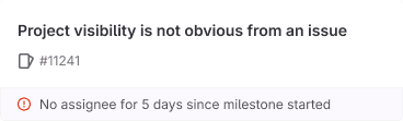
Furthermore, past usability benchmarking demonstrated that the task “view current status of work” has an overall SUS (System Usability Scale) score of 77, which is significantly lower than other task ratings.
Some key pain points were that users felt like current issue boards “lack an easy, at-glance view of status” as they struggled with where to look, “did not notice summary metrics” and had to “manually tally up issues and do mental math to summarize status”. Notably, “4/20 participants were unable to get a view of the current status of work”.
User Challenge
We conducted our first round of interviews with 7 PMs who are GitLab users, including some internal GitLab staff recruited through GitLab recruitment, aiming to understand how users identify at-risk issues and their pain points with the current design.
2 prominent themes emerged as we were synthesizing our findings in Dovetail.
1 - Understanding progress
No clear big picture layout so PMs have to gather information from many different places
Overwhelming UI due to cluster of labels
Hard to navigate the board because of the amount of information
2 - Jeopardy indicators
Health status, merge requests, and comments are important information that PMs look for
Additional interactions with the board are required by PMs to check for more details regarding the progress of an issue
Ideation
I completed a Crazy8s brainstorm exercise to generate a wide variety of solutions and push beyond surface-level ideas.
Of all the design concepts generated by the team, 3 stood out:
Concept 1: Dashboard / Banner
Displays key information about at-risk issues

Concept 2: Visual Indicators
Highlights which issues are at-risk
Concept 3: Timeline view
Shows the progress of issues
These 3 concepts were notable because multiple team members converged on these same concepts in their individual ideation and we all felt they had a high integration feasibility with current issue boards.
Ultimately, our team proceeded with the hybrid Concept 1: Dashboard / Banner because we felt like this option offered high flexibility with different PM workflows. Users would be able to customize the visibility of relevant information needed to understand issue status.
We explored different possible visual treatments. Some outstanding concepts and their iterations include:
Option A: Top Banner

Dropdown top banner
Sprint progress overlay
Alert banner with stat cards
Option B: Dashboard
Center pop-up
Side panel
Full page
We decided to go with Option A: Top Banner because:
✅ Stays in context
Top banner allows the user to view and possibly interact with their issue board. It doesn’t open up a new page or block a major portion of the entire board.
✅ At-a-glance view
People are used to scanning from top to bottom. Therefore, the top placement of the banner allows the users to quickly glance at how many issues need their attention and why.
✅ Utilizes existing metadata
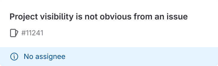
The 3rd iteration “Alert banner with at-risk issue stat card” considers technical feasibility as this view allows us to utilize existing metadata that is already available on GitLab issue boards (overdue, no assignee, etc.).
Concept Testing
In order to understand the users’ impressions of our two design concepts: Top Banner + Filter and Risk View + Cards and compare their ability to address the problem statement, we conducted concept testing. We interviewed a total of 5 participants through GitLab recruitment, 4 being internal to GitLab.
Concept 1: Top Banner + Filter

Concept 2: Risk View + Cards

Key Findings from Concept Testing
🙌 5/5 testers chose Concept 2: Risk View + Cards with the most common reasons being:
The cards allows users to quickly glance what, how many, and why issues are at risk.
After toggling on the “Risk view”, the cards are contextual and logical.
The action buttons associated with the at risk issues allows users to easily take action (e.g. Add assignee if “no assignee”).
🤔 Some surprising outcomes included:
Some testers did not like or found the action buttons useful (ex. product managers will typically need more information to be able to “add an assignee”. )
2/5 testers noted that they want to view all the other issues in the “at risk view.” This is because seeing the other issues will help them allocate the at risk issues accordingly.
Fewer than half of the testers noted the possibility of configuring the filters, but for the ones that did got excited about the idea of configuration.
With these key findings from concept testing, we translated them into design issues we needed to tackle:
1 - Design doesn’t match current mental model of banner.
2 - Banner is too large and takes up too much vertical space.
3 - Poor discoverability of the “Risk view” toggle.
4 - Are action buttons necessary?
Design Change #1
From the surprising outcomes and design issues identified earlier, we refined the designs. Below are a few design changes we made:
Added a popover to increase discoverability of Risk view toggle
When we tested the header, all participants did not notice the Risk view toggle at first. However, once they discovered and used it, they quickly remembered the location.
Remove action button and change banner color
People indicated that assigning assignees is not their job OR that they need to click into the issue to get more context before making a decision. Some interviewees noted how it’ll be great if the banners can reflect the severity of the “at risk”.
Before

Yellow banner + action button
After

Red banner (high severity)
Blue banner (medium severity)
Display all issues to see at risk issues and other issues together
2/5 participants noted that they want to view all the other issues in “Risk view”. This is because seeing the other issues will help them allocate the at risk issues accordingly.
Before

After

Configuration as side panel
Changing it to a side panel gives the user the ability to also view what’s on the board when customizing the risk conditions (not possible with a center modal since it’ll block everything behind).
Before
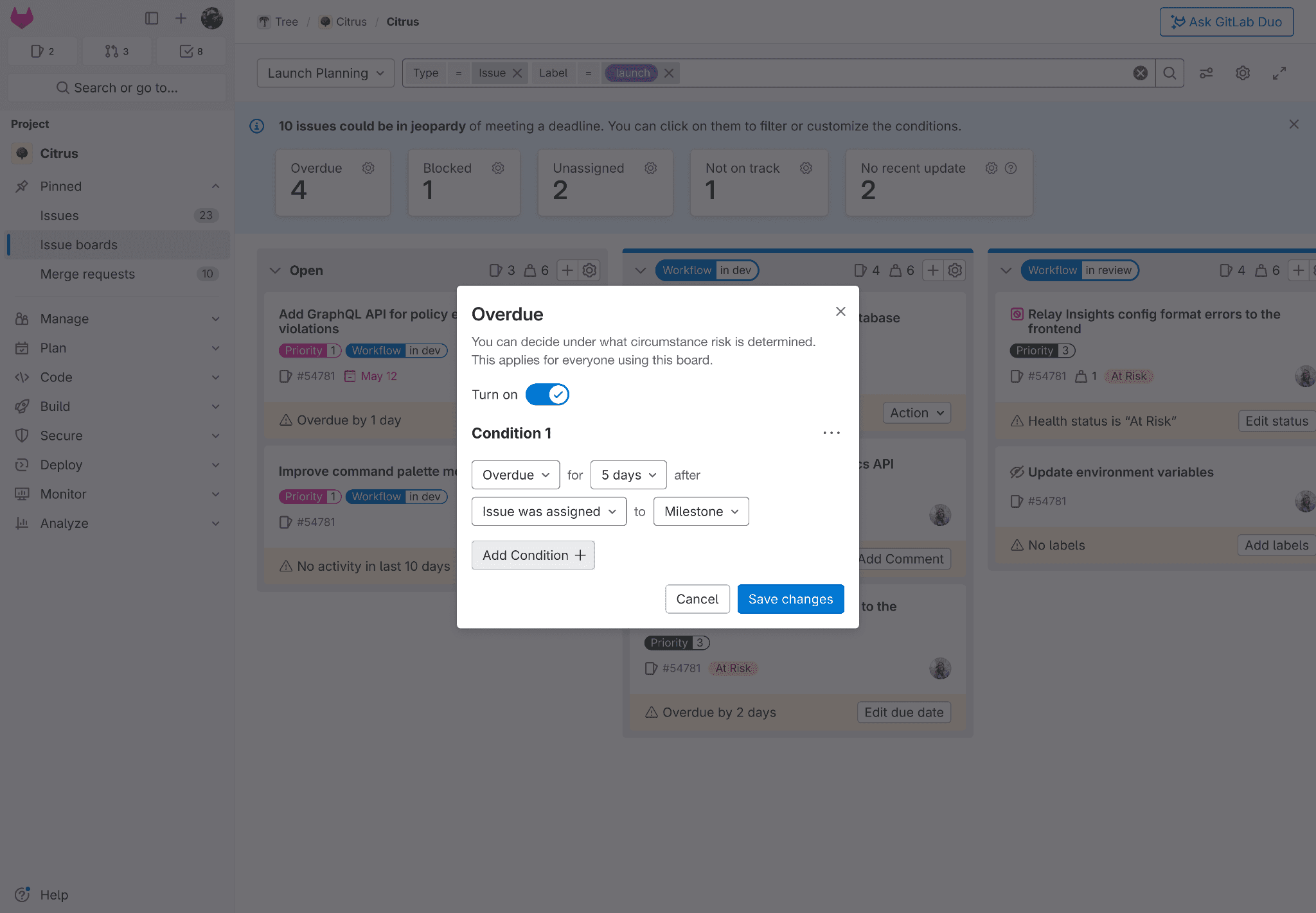
After
Usability Testing
We conducted usability testing based on our new design with 5 participants who do not work at GitLab through GitLab recruitment. We also consulted with the GitLab design team for feedback.
One challenge we encountered was that the majority of participants didn't actually use GitLab issue boards. This was challenging because our new designs assume users have experience with issue boards and our team needed to validate assumptions from previous concept testing.
Even though the screening survey asked participants whether they had used GitLab issue boards before, many of them assumed that using other project management tools such as Jira Align translates to having experience with GitLab issue boards. Nevertheless, we still received valuable feedback.
Design concept tested

We asked participants to perform two tasks with quantitative and qualitative success metrics to objectively evaluate our designs.
After each task, we asked them to rate their experience and confidence on a Likert scale of 1-5, where 1 is not confident at all and 5 is very confident.
🎉 5/5 task completion for identifying at-risk issues on issue boards
🎉 4.5/5 task completion for configuring the “no activity” card
Participants' verbal feedback gave us a more detailed insight into our current design. Key insights include:
🙌 Participants look at metadata but not all.
This is dependent on their own preference, habits, and team culture.
🙌 Customization is appreciated.
Participants appreciate the customization of cards and configurations based on their own preferences.
🤔 Certain phrases are unclear.
Some participants don’t know the exact meaning of “no activity” and “not on track” because these phrases are very context dependent.
🫤 Accessibility concerns exist in the design.
The current design has anti-accessibility patterns such as a button being inside another button.
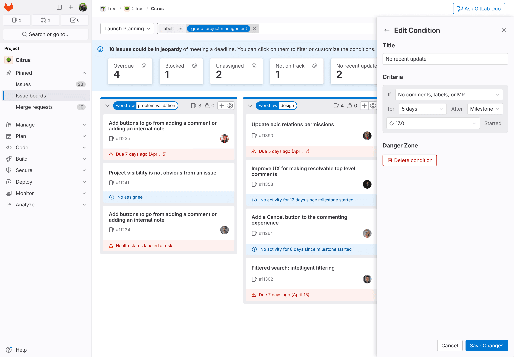
Design Change #2
Make configuration universal
To avoid nested buttons (anti-accessibility pattern), we moved the gear icon from each stat card to the banner which allows users to edit all their configurations at once.
Before
After
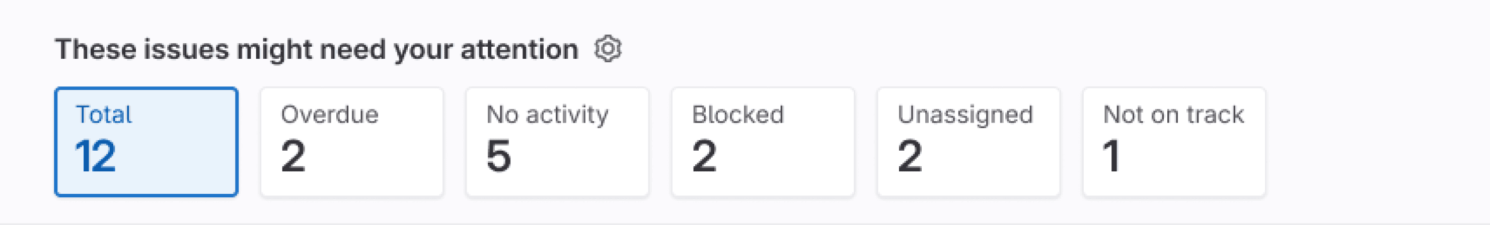
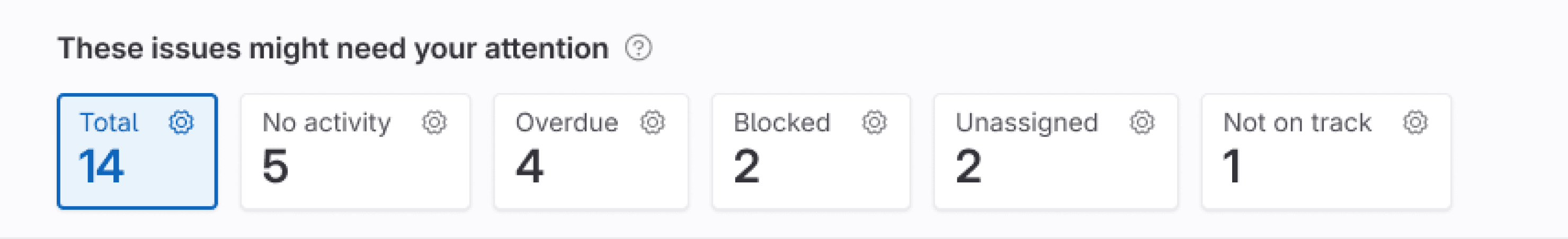
Change issue board banner color from red and blue to grey
Too many colors added to the overwhelming UI of issue boards, so we decided on a gray banner and bolded the heading to create a better visual hierarchy.
Before
After

Make configuration criteria for "no activity" more specific and flexible
As “no activity” is very context dependent, we included more defined criteria such as “no comments or no merge request”. The users can also change the logic in the configuration such as from “or” to “and” and can add an additional connector at the bottom of each drop-down.
Before
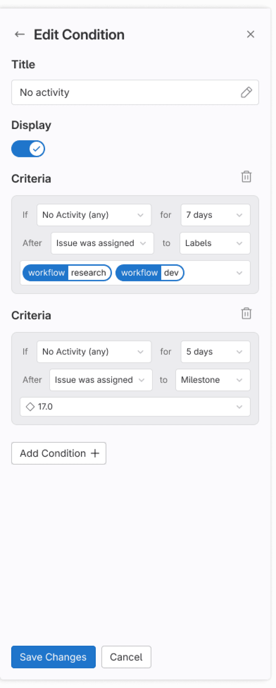
After

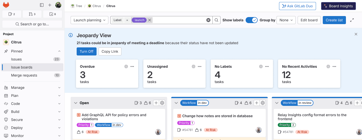
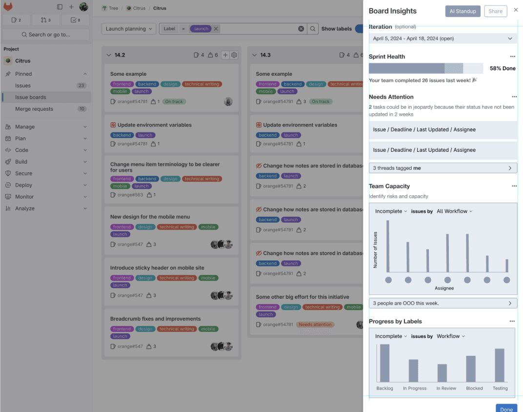
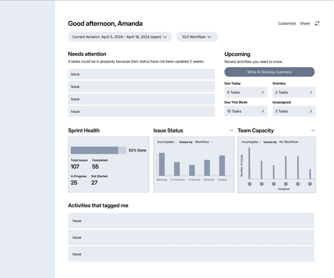
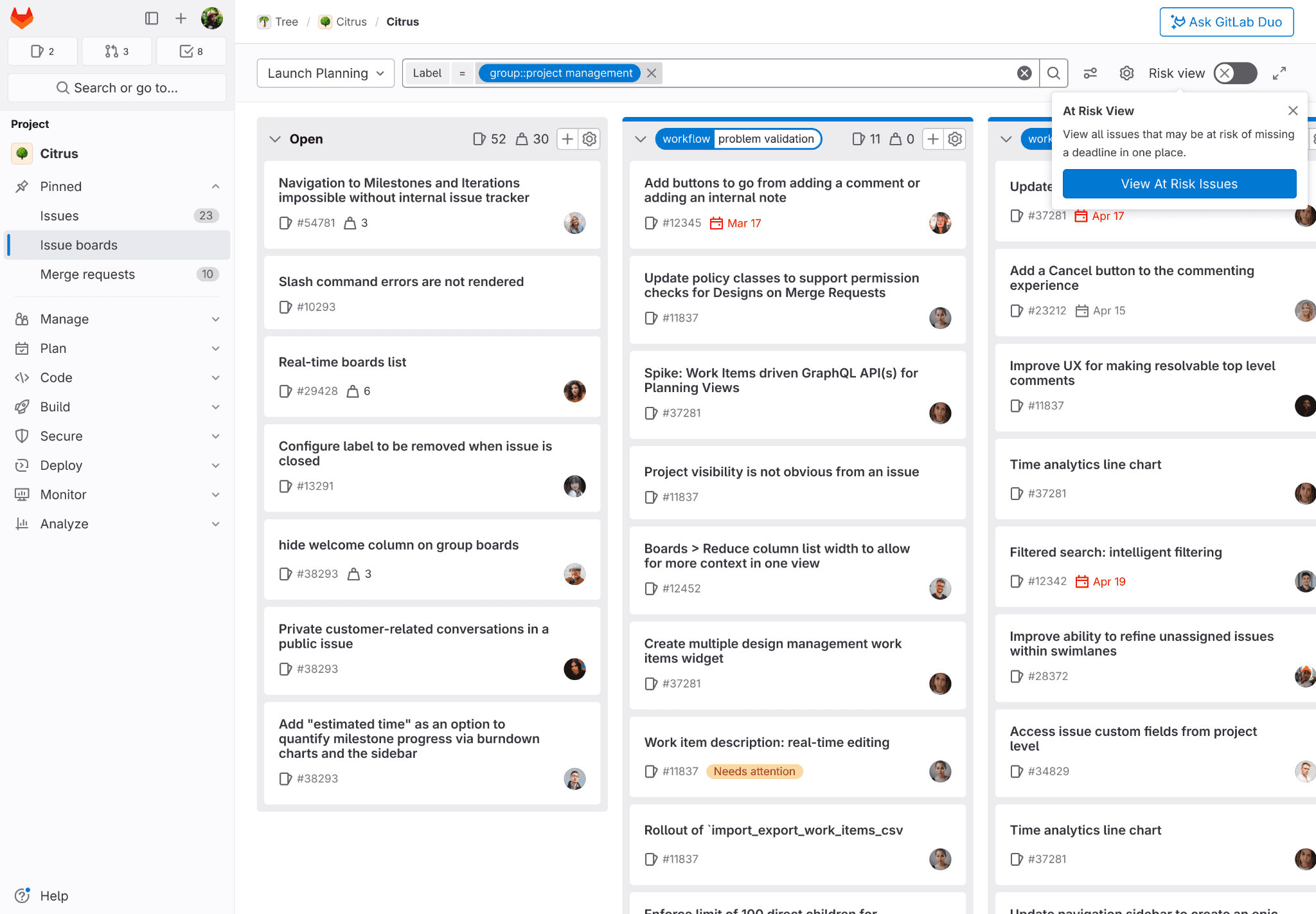
Final Design
Our proposed solution is called the ‘Risk View Dashboard’. It enables Product Managers to identify at-risk issues quickly and define specific at-risk conditions, as well as customize the scope of Risk View directly to the particular board they are using.
This is a significant improvement from the current UI, which requires PMs to take as much as 45 minutes to scroll through 50 issues to find out which ones are in jeopardy of missing a deadline.
View by Condition
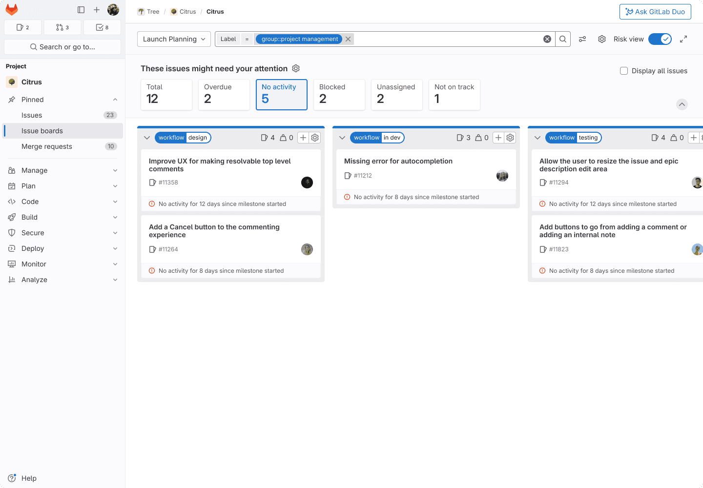
Customize Conditions

Edit Criteria
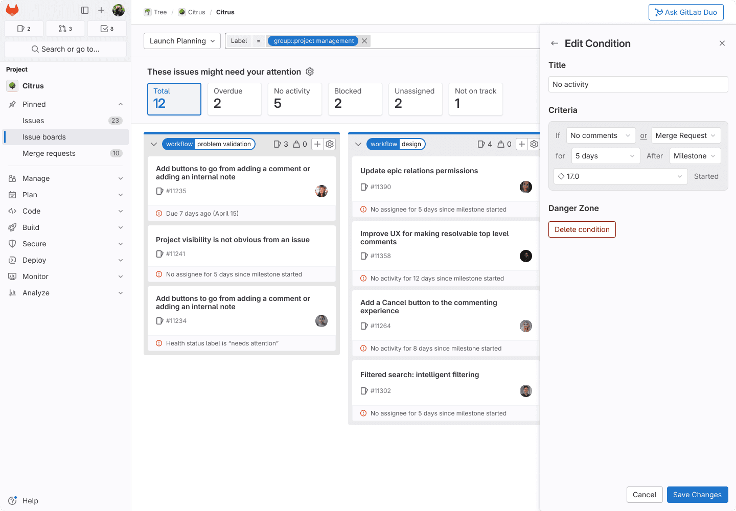
Display all Issues

Collapse Banner

Before
After

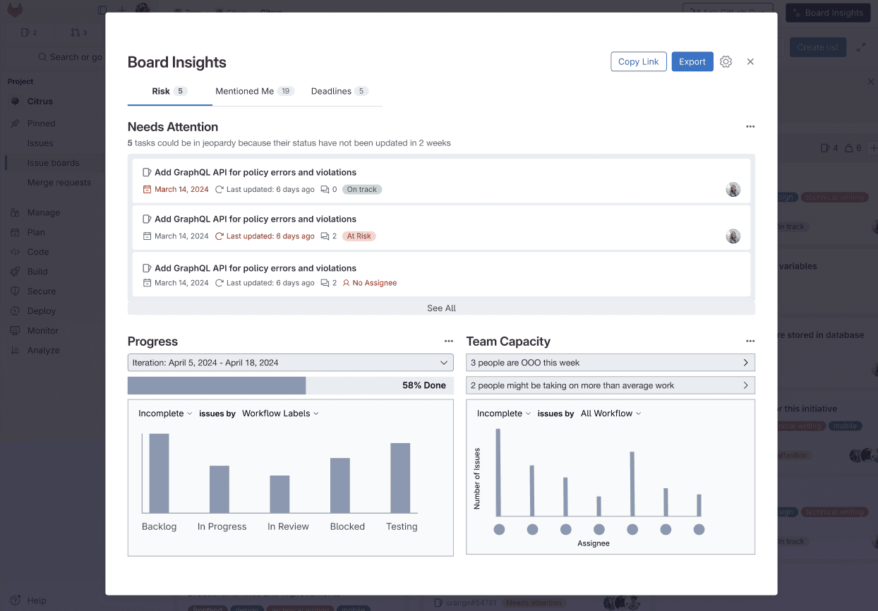
Key Features in ‘Risk View Dashboard’
01
Surface necessary information
The Risk View filters relevant issues for the user to review within one or two clicks, eliminating the need to manually scroll or apply multiple filters. This allows users to easily identify at-risk issues and save time for more strategic work.
02
Increase trust and control
When users hover over the cards, a tooltip explains "no recent activity" in detail. They can also see a gear icon next to the section title, indicating configurability.
03
Reduce visual noise
A gray banner with a bolder heading for better visual hierarchy draws attention without adding visual noise. This aims to create a focused view, bringing calm and a sense of control to users instead of adding to their anxiety.
“So when will this be in production? I want this in all of my GitLab issue boards!”
Product lead (Non-GitLab)
“Your deliverables were great and we appreciated you jumping in to use tools we use (Dovetail & Figma) to produce high quality deliverables. It will make it more likely that we can use them for developing this new feature.”
GitLab Design Team
What I learned
Research
Working in the DevSecOps space, I learned the importance of familiarizing myself with the terminology and agile planning processes used by PMs. Through guerrilla recruitment strategies and testing various methods, I discovered effective ways to optimize response rates. Designing research questions taught me how to determine the most effective structure and content for user research. Using Dovetail, I learned how to distill user research into key qualitative insights, which provided valuable direction for our project.
Design
I learned the value of thoroughly thinking through each step in the Jobs To Be Done (JTBD) framework and understanding user needs before jumping to solutions. I realized the importance of ideation, as our initial ideas evolved significantly into a refined final design. Focusing on interaction details taught me to be specific about which components should be dismissible, what information to present, and how and when to surface it. Additionally, I learned to navigate the complexities within a system by considering how decisions impact different personas, setups, and conditions, ensuring accessibility, and determining the appropriate placement of features within the product.